THOMSON REUTERS / Westlaw
2018


Westlaw is the flagship product of Thomson Reuters - the top legal content provider in the US. I contributed to initiatives like Home page redesign, Practical Law Global, a court-docket reporting tool, a web analytic tool for FindLaw, and the responsive design system below.
Project: Westlaw Responsive Design System
intro
In this project, I served the team as a UX designer and strategist, alongside a visual designer and a researcher. Our task was to redesign the Westlaw platform into a fully responsive website, and with it, creation and documentation of the responsive design system. It was the most impactful project I had the opportunity to be a part of in Thomson Reuters.

Problem
Westlaw is a content-heavy, web-first product, with 20+ page templates. Prior to the project, there were 4 different mobile experiences. Using Westlaw on a mobile browser and Android was confusing & uneven, and very different from iOS and desktop.
Process

I led the team in crafting a series of design sprints (base on Google Venture’s). The idea was to put stakeholders in a room to quickly understand the problem, decide & sketch solutions, and craft a prototype to test.
During the sprints, we created components by redesigned most used page templates into mobile first, following Atomic design principles. We created a Sketch symbol library, with version control and sync to other designers via Abstract.
Eventually, we refined and documented the rule set (alongside live-code and a11y rules) - and turned a symbol library into a Design System.
RESEARCH METHOD
We set up time for research in each design sprint. First qualitative and content research, then 5 rounds of lean testing. It really helps that we had the same user panel for reaction to iterations. (Adapted from RITE - Rapid Iterative Testing and Evaluation).

First round of testing focused on Content Hierarchy on an average Westlaw article
We learned 5 important insights:
If you build it, customers will come (traffic to mobile will increase naturally)
User want fixed access points
Fewer access points = Less guessing
Usability > Familiarity
Mobile Ergonomics is important
The design evolved as we learned more about our customers and identify usability issues and preferences.
Result

Mobile page templates
RESPONSIVE SYMBOLS
I learned to use a combination of Sketch settings to create symbols that can be resized in between breakpoints - true “responsive” symbols.
Analytics show that Westlaw customers used a wide range of device width. For example, many government users are on a vertical, low resolution monitor instead of a tablet. So, symbol resizing made it easy to create prototypes for certain segments. It also made dev hand-offs easy.

Headers are true responsive symbols
Adaptive PAGES

Different versions of article for A/B testing
The team needed to justify the cost of creating of a different, adaptive layout for some features.
So, I built A/B prototypes in order to test user preference. We found out that customers prefer adaptive design in the article experience.
ORGANIZING THE DESIGN LIBRARY

I designed the hierarchy of the symbol library to make the most sense for both designers and engineers, by gathering feedback constantly or by observing them in practice.
I used design tokens to name atomic components. They were really helpful in hand-off to dev for the live-code html/css/js component library.
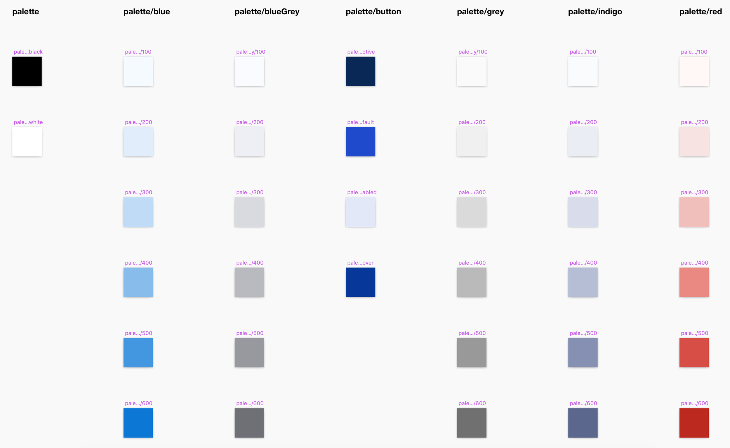
Design tokens used in developing the color ramp
Summary

The team successfully set up a design system, and improved the Westlaw experience on mobile.
I learned a lot about facilitating new processes. Our design sprint format was a win for UX. The process was then adopted by other teams. I also learned to evangelize a design tool with Abstract - as the team’s Abstract ambassador.
Most of all, I am proud that we were customer obsessed. In research, I could see how our work help the daily lives of legal professionals, who now can use Westlaw content on the mobile phone.